
Wednesday, December 30, 2020
Monday, December 28, 2020

Sunday, December 20, 2020

Friday, December 18, 2020

Alvarez - Art Analysis of Bond of Union - MC Escher 1956

For the Art Analysis assignment, I chose Bond of Union by MC Escher. While looking through Escher's impressive gallery, this piece immediately stood out and the more I looked at this piece the more complex it seemed. Escher uses geometric shapes throughout his work, and in this drawing he creates spheres. Escher uses the spheres to provide form and space by giving them value and making them appear smaller and darker in the back and larger and brighter in the front. Escher depicts unity in this drawing by intertwining the two faces with each other through some sort of ribbon. This ribbon that forms the faces provides movement in the drawing because of the way it wraps around and connects to itself. Escher shows enough detail on the faces to make it appear real and whole by making patterns on the hair and contrasting textures throughout both faces. Simultaneously, he brilliantly gives an emphasis on the empty space as well to leave the viewer with curiosity, and maybe even confusion. This allows for us to try and interpret the drawing for ourselves.
I believe that the most important criteria for judging artwork is understanding the piece’s history and the artists intentions of creating it. I think that by observing the skill and technical elements of the drawing and trying to link that with the arts deeper and more emotional meaning and purpose we can most accurately and fairly judge a work of art. Of course, art isn’t always like this and many times artists intentionally go against rules of technicality. For example, in abstract art some artists will leave it to how we see their piece to decide if it's “good” or not. Based off of my analysis,I think this drawing by MC Escher is great because of its creativity and use of different artistic techniques.
Jane Chen - Art Analysis of Shirley by Chuck Close 2007


Hitchens- Art Analysis of Blue Dancer by Edgar Degas c. 1899

In this artwork by Edgar Degas titled "Blue Dancers" there are many elements and principles, but the ones that I noticed first were Color, Value, Texture, Balance, Movement and Contrast. Color is obvious as to why I listed it, you see various colors like blue, yellow, green, orange, purple and brown. Next, there's value mostly present on the shoulders and backs of the dancers. The texture that is shown on the dresses and on the wall that the one dancer is touching. Movement is intended and foreshadows through the dancers positions, it makes the audience believe that the dancers are in motion, Balance and Contrast are present as well, the balance are the dancers and the wall and the contrast is shown by the different positions of the dancer.
The criteria that I think are most appropriate for judging artwork are attractiveness, uniqueness and being open-minded. I think that if you aren't attract to the artwork, then you cannot judge it. In order to be able too judge the artwork appropriately, you also have to keep an open mind. An art piece that you may not like initially may change your mind if you continue to look into the deeper meaning. Lastly, I think that artworks need to be different. If everyone has the same type of artwork, then we wouldn't be able to judge them.


Marley- Georgia O'Keeffe Drawing Analysis Drawing XIII
Drawings by Georgia O'Keeffe, January 29–February 10, 1923, no catalogue.

This drawing by Georgia O’Keeffe, called drawing XIII is very interesting. It uses great value with the swirls being lighter and the round shapes being darker. She also uses many different shapes. She uses shapes with sharp edges on the side and in the middle she uses very round and soft shapes. Many different types of textures are also used. There is a kind of rough texture in the round and swirl shapes. But in the shapes with sharp edges the textures become very smooth.
This drawing has a great sense of rhythm with transitions in shapes it really makes the whole drawing come together. It has a great pattern of different shapes and it does such a great job of flowing from one shape to the next. Lastly, this piece has a great sense of unity. All the shapes seem to be working together in harmony. They are all different shapes, but variety adds interest and every shape works together to make a wonderful image.
Nathan Oristaglio Art Analysis of Public Sale by A. Wyeth 1943

Nathan Oristaglio Art Analysis of Public Sale by A. Wyeth 1943
This piece by A. Wyeth has several key principles and elements that make it unique. First the dull colors used which was something I noticed with all of his paintings which is unlike some painters that prefer to make vibrant pieces that stand out for their color. The backdrop of a hill filled landscape gives both the illusion of the rough texture of the dry grass and a large space as we can far off into the distance. Wyeth has made a clear emphasis of the car and the two men standing next to it as you can see the tire tracks leading to it. This presents a sort of mystery about these two men and who they are because they are separated from the crowd in the background. There is a contrast between the dark dirt road leading to where you can see several people in the background and the dry yellow grass. Lastly and one of the less noticeable features is the rhythm used when he drew the grass.
Now the first time I looked at this painting I had a problem with the dull colors which actually put me in a somewhat dull mood. Then I thought how quickly this painting had that affect and realized it was intentional and his paintings which use this color scheme are meant to evoke a somewhat negative reaction. Overall I think this painting is a great piece of art that has many aspects that I mentioned. One of the only paintings I've seen that manages to stand out despite a dull color scheme.
Ella Strohmaier-Art Analysis of Praying Hands by Albrecht Durer

In this drawing there are multiple different elements and principles in this drawing. One element used is lines. The drawing has many lines throughout it and they define the hands' detail very well. Another element used is value. Durer used a full value scale where you can see white, black, and the neutral color of the blue background. A third element used is texture. The texture is used in the drawing is the lines on the hand that make the hands look very life-like and 3D. A principle used in the drawing is balance. Durer used balance by making the shadow on the hand very persistent and unchanging on different parts making it even. A second principle used in this drawing is contrast. The contrast in this painting are the very dark colors next to the very light colors used. Another principle used is unity. Durer is very consistent in what line shapes he used in this drawing, making all the lines very similar on the shirt, and on the hands he used a different line shape to show the difference between the shirt and hand.


Keeleigh Art Analysis of Re-Echo by Lee Krasner

In some of Lee Krasner’s paintings you can tell that there are many abstract lines all over the place. In his paintings I can see that there are many abstract shapes that I can't really describe, the painting almost looks kind of confusing. There is a lot of value in his paintings and it doesn't really look like there is much negative space. There is some contrast in this painting with all the different colors, I can see all the colors and they all kind of go together and match. The drawing has a lot of movement in it and all the places that were painted look very round or square or cut off and it looks like Lee just took his brush and went for it. I think if I was judging artwork I would look for uniqueness and value and abstract. I think this because a painting that has those three things is what makes the artist the artist and not anyone else. I think this is a good artwork because it is very unique and you don't see much artwork like and I like almost the randomness of where everything was put and even though it is so random the shapes, lines and colors all work together to make this unique and abstract painting.
Thursday, December 17, 2020
Boyer-Art Analysis of The Map- Mary Cassatt 1890

Art Analysis
In this piece of artwork I see value used to represent the shadows from dark to light on the two girls. I also see lines in the girls hair to represent strands of hair. I see black and white color throughout this artwork, with no bright, vibrant colors. I see rhythm within this drawing because of the repetitions of the lines and shapes on the girls. I also see movement within this drawing, which looks to be the girls doing something, but there’s not enough detail where I can see what, but it looks like a lively drawing. Lastly, I see contrast between the light, cream background, and the girl on the right dark shirt against the background.
For judging artwork, I believe that the judge needs to be creative, so they can see the different aspects of the piece, and for abstract work, they need to be able to be creative and imagine what the artwork looks like. The artwork also has to represent different principles, so that people can be able to understand the art. I believe that this is good artwork because the sketching is very well done, and it shows the value which makes the drawing look very realistic. It also somewhat looks like the girls are in motion. It looks like a drawing out of a book!
Maddie Priest - Art Analysis of The Dream (The Bed) by Frida Kahlo
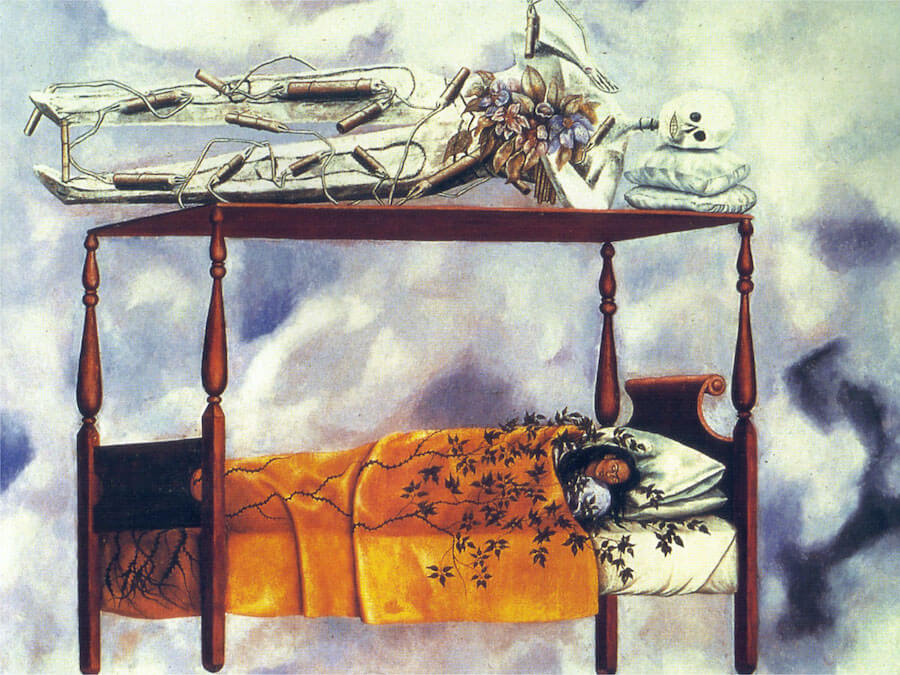
The artwork, The Dream, also known as the Bed, displays many different elements and meanings. This piece of artwork made in 1940 was by Frida Kahlo in, a Mexican painter. First, within the artwork there are forms of space. Frida Kahlo has painted herself in a bed, and surrounding her is a vast area of the sky. The sky surrounds Frida Kahlo as she is in her bed; this describes the space around her. Along with this, there are different forms of values. One can see as they look at the painting where light hits and where shadows emerge. The blue sky seems dark on one area, while it seems more light on the other. There is also a shadow cast upon Frida as there is something above her bed frame. Now, color is something that plays a large role in this piece of artwork. There is a color scheme that goes on, and that includes the colors yellow, blue, and white. These colors work together to create a bigger picture of what is going on.
As there are different elements in this work, there are also different Principles. To begin, there is Pattern. There is a pattern on the skeletons body as there are brown objects that cover the skeletons body. These brown objects seem to be dynamite or cigars. The pattern of these brown objects continues down to the legs of the skeleton. For Frida, there is a pattern in the vines that cover her body. The leaves are patterns. Another Principle includes rhythm, there is the repetition of different shapes in the sky, and the different shapes in the skeleton’s and Frida’s body. The last principle includes Emphasis. The background of thre work is plain and simple. This allows the audience to focus on the bed thay Frida and the skeleton lie on.
The criteria that is most important for judging artwork is the meaning that it represents through its principles and elements. Based on what I see, this is beautiful artwork. Frida’s background includes how she went through depressive phases and how she had almost taken her life twice. This is beautiful artwork to symbolize Frida’s story. The skeleton on top of Frida could resemble death, and ending. Death is lingering over Frida within this picture; this can describe what was going through her mind. In the picture, the veins in Frida's artwork almost swallow her. In some of Frida’s other works, she uses nature a lot. These veins could resemble peace, and how nature brought her peace. In the overall picture, Frida is alone with the skeleton in the sky. This shows how Frida had to fight her battles against death alone multiple times. The veins and nature surrounding her show how nature brought her peace. Overall. The stories this artwork shows makes it a beautiful piece and work of art
Bella Hughes- Art Analysis of Head Of a Young GIRL Veiled by Kehinde Wiley c. 2019

Art Analysis
In this piece I see repetitive lines used to represent a vine incasing her body. I see the back-round shapes that are used to create patterns that are used for an entertaining back drop. Not only does the back-round colors of orange, green, yellow, and light blue create a visual, but the vibrate neon green sweatshirt allows for the viewer to focus on the importance of the piece. I also can see a constant unity between the main point and the back-round movement (vines, from the back-round, moving up her shirt). Different forms and shapes create a variety of complex structures to focus on.
I believe, in order to judge art work, one needs to have an open mind and to see things from a perspective one might not usually take. I believe that this art really has depth and represents the mental struggles and how one might, even with light surrounding, still be in the dark.
Blessington-Art Analysis of Three Wise Men Greeting Entry into Lagos by Kehinde Wiley c. 2008
Description
For starters, Kehinde Wiley executes multiple elements of art within his canvas paintings.
He utilizes a variety of colors and shapes throughout his work.
The contrast in colors allows him to use illusions in order to create space throughout his work.
This space enables Wiley to fill the void with form, often occurring through three-dimensional figures such as the Three Wise men.
Moreover, various principles can be found in his work.
Wiley decorates his surfaces in elaborate patterns, which make his work unique.
He also paints shapes, lines, and forms in repetition, adding a smooth rhythm to his interesting paintings.
Finally, Wiley emphasizes the subject of his work as they appear to pop out of the canvas.
Analysis
The most appropriate criteria for judging artwork is based on creativity and effort. The art piece should be unique to each individual artist and possess a personal touch or element. In my opinion, Kehinde Wiley’s work is very good. He focuses on several elements and principles of art, creating an innovational sense of work as his art does not resemble any other artist in particular. For example, Wiley's variance in color and utilization of several different shapes makes his work more appealing to viewers. They demonstrate different moods and tones within the painting as the colors change. The forms that fill in the space tend to contain different patterns on their clothing. This aspect of Wiley's work provides a sense of rhythm as the paintings flow smoothly. In conclusion, Wiley clearly puts time and effort into his work, which is the most important trait of a successful artist as he does not waste any talent.
Tuesday, December 15, 2020

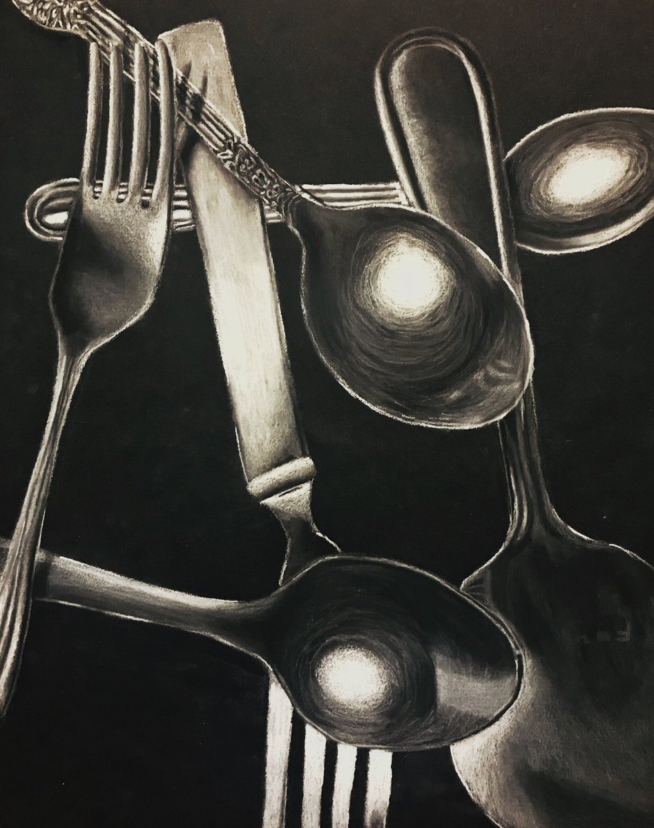
EXTRA CREDIT OPPORTUNITY
Introduction to Drawing/Silverman
Extra Credit Opportunity, 30 points
Due 1/5/21 6pm, posted to blog
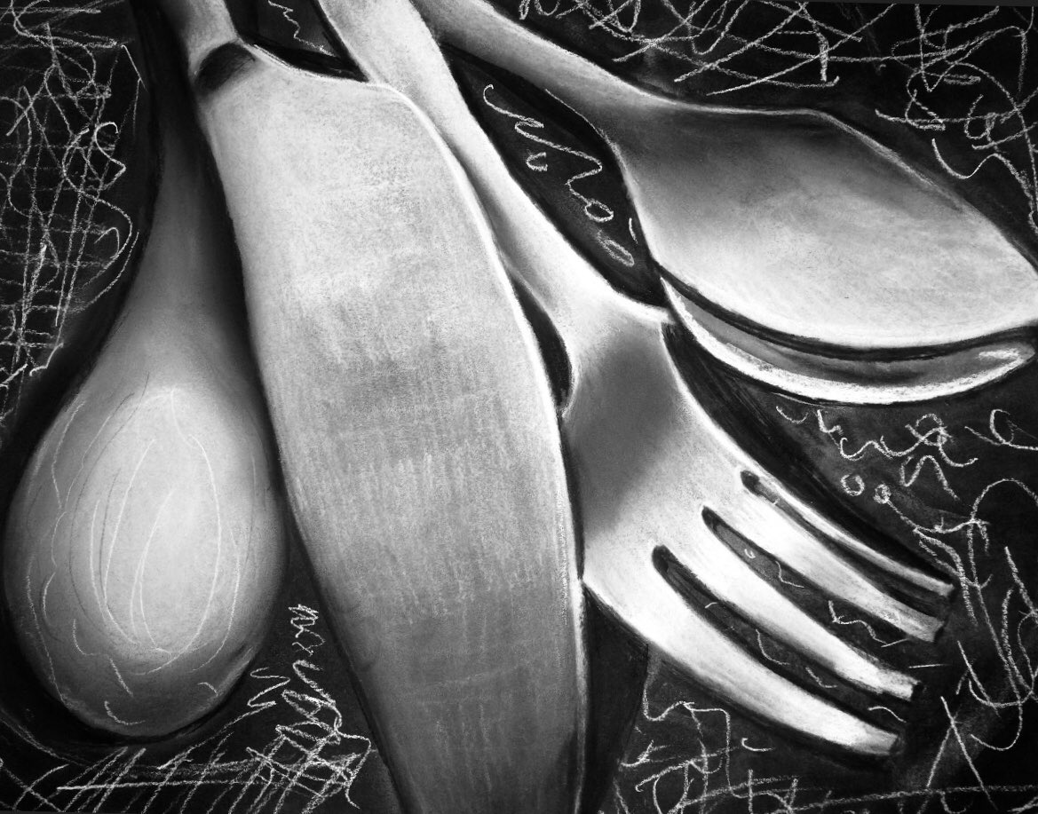
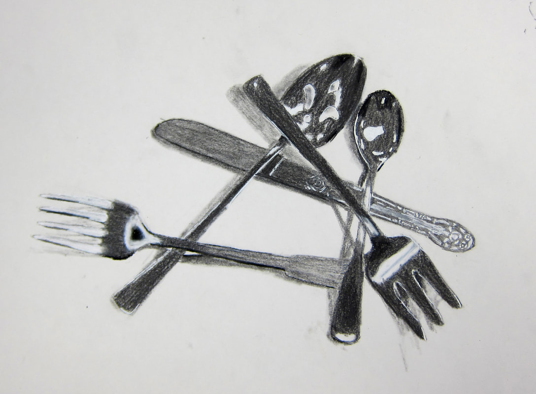
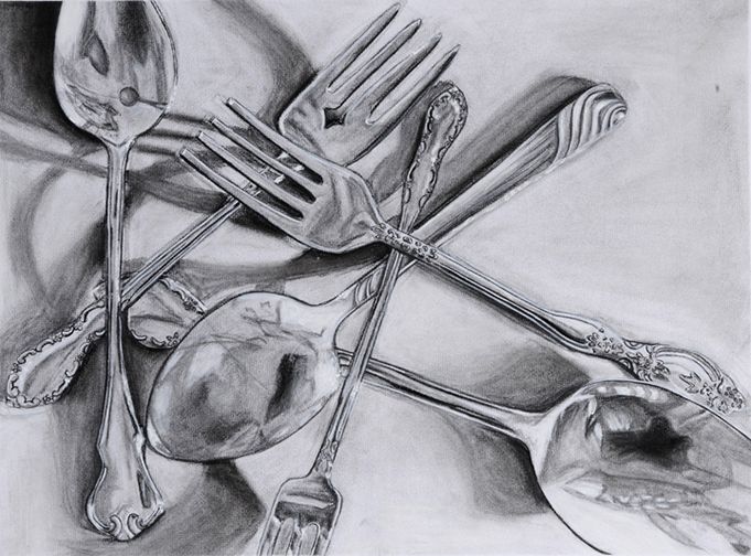
Assignment: Complete an observational study of at least 5 pieces of silverware, overlapping in space.
You should invest at least 1 hour of time (if not more) in this drawing.
I recommend setting this up under a bright light source. If you choose to draw on black paper, set up the silverware on a black piece of paper to approximate the value of your drawing surface (paper) and to help you establish accurate contrast/value. First, be sure to complete a light contour line drawing to establish relationships, and then add value considerations and address the reflective surface quality of the silverware.
Material choices: Charcoal on white paper, or white chalk/pencil on black paper.
Minimum paper dimensions: 10” x 8” or 8” x 10”
Examples:


Bellace- art analysis of After the Battle, 1907

For this piece specifically, much of the definition of the piece is due to movement, especially of the individual in the center who's bending down. The linework is very similar to what is used in class in which there is an implied edge or blended contour line, rather than a stiff black line. The use of movement and lines creates the form of people and faces, the center person sticking out the most, and the faces, surrounding her feet, create a swirling and almost chaotic effect. The thing I could most compare it to is the river Styx in Greek Mythology. There is a value scale, being a grey scale, and many of the shapes and forms are darker greys and blacks, however, there is stark contrast between the light the individual is holding and pointing to the ground against the rest of the background. This grey scale also relates back to the use of color, looking at her other works, it seems black and white is her common color pallette, but for this piece specifically, it adds another layer of emotion. Considering this piece is about "after the battle" it would make sense for the piece to be darker and colorless, as it portrays a very grim and solemn event and emotion, the black and white reflecting this as well. There is also a use of space, as we can make out the people surrounding the middle person, the light, as well as the hills and clouds behind and above her, while the space around her where the faces are located seem to be muddled and almost chaotic, this doesn't take away from the perspective or spacial use, if anything, it adds to it.
When it comes to artwork, at least for me, I tend to look for the person in the piece. Art is a reflection of the person, their mentality, their emotions, and who they are as a whole. I want to be able to see the person in the art they create, whether that be emotions, the person's interest and style, etc. When scrolling through instagram, I tend to look for original characters or stylized art styles. I like seeing original an unique pieces, a person's ocs, etc, so I often find myself gravitating towards pieces that are more fantastical, stylized, or just overall unique and interesting. As a comic and manga fan, I also tend to look for how much the style sticks out among others, or how appealing it is and why. So I tend to look for the person and a reflection of the artist in the work. I want to see why they made the piece, how much care and time they took on it or how much they cared for it, I want to see the person's self within what they create, cause to me, that is true art. On account of that, I tend to glimpse over realism, as they are, often times, just a recreation of an already existent thing or picture, for me, they lack emotion and style, as well as the reflection of who that person is. I can't see that person in their realism, often, cause it's not a reflection of themself, but rather, what they copied.
When it comes to this piece, it's not something I'm super interested in. I'm not the hugest fan of the art style, and it's, to me, just lacking in the typical elements I'm drawn to, however, looking at the swirl of faces around the person in the center does strike me, and is something that draws me in. Like I said, it remind me of the river Styx, so I immediately feel interested and even connected to it. Even if it's not my favorite piece of even something I particularly care for, it is technically enhanced and well done. I wouldn't say it's super original, as there are other pieces I've seen similar to it, but it is an original take on a sadly common event of war and a solemn feeling and situation. It achieves what it seems to be going for, which is to strike a contemplative and emotional chord with the viewer. It does just that while being technically advanced and well done. So, even if it's not something I'm personally attached to, it is undeniably a good piece.


Monday, December 14, 2020


ANNOUNCING OUR TOP BLOG CONTRIBUTOR
For the first half of quarter 2, the trophy goes to.......

Sunday, December 13, 2020


Subscribe to:
Comments (Atom)

-
In this artwork by Edgar Degas titled "Blue Dancers" there are many elements and principles, but the ones that I noticed first wer...
-
The artwork, The Dream, also known as the Bed, displays many different elements and meanings. This piece of artwork made in 1940 was by Fr...


